 This weekend, I was pointed to a post by Architect of the Capital (not to be confused with the Architect of the Capitol) about a trove of Soviet-era maps, the men who have made a study of them – and the map of Washington, D.C. that was created at a time when it might have been used by Warsaw Pact troops seeking to take over the United States.
I was drawn, of course, to the part of the map that covered Capitol Hill, and what it showed about what the makers were interested in there. The obvious comparison is the USGS topological map, which I found at the USGS’s National Geologic Map Database project website.
Right off, it is clear that there is a distinct difference in what is important. Large buildings tend to dominate at the Soviet map, with the Capitol and its various buildings being easy to spot. At the other end of the Capitol, RFK Stadium and DC General can be seen. The hospital is labeled ‘Gospital Kolumbia’ (which looks odd, but is actually half correct – there is no ‘H’ in Russian, so words starting with that letter that are taken from other languages – like the word Hospital – start with a ‘G.’ The ‘Kolumbia’ is their own invention.)
Also amusing are the street names: It appears that the mapmakers were not too worried about the exact names, thus simply added ‘Ulitsa’ (Street) to the transliterated English name of the thoroughfare, giving us улитса индепенденс авеню (Ulitsa Independens Avenju) instead of проспект независимость (Prospect Nezavisimost’) South Carolina Avenue is transliterated to улитса саут каролина авеню– Ulitsa Saut Karolina Avenju.
Where it starts to get wearisomely wrong is in the street names. D Street is улитса ди стрит (Ulitsa Di Strit) And quadrants? Forget about them entirely. Any invader trying to make his or her way through the streets of D.C. with this map would have been hopelessly lost in short order.
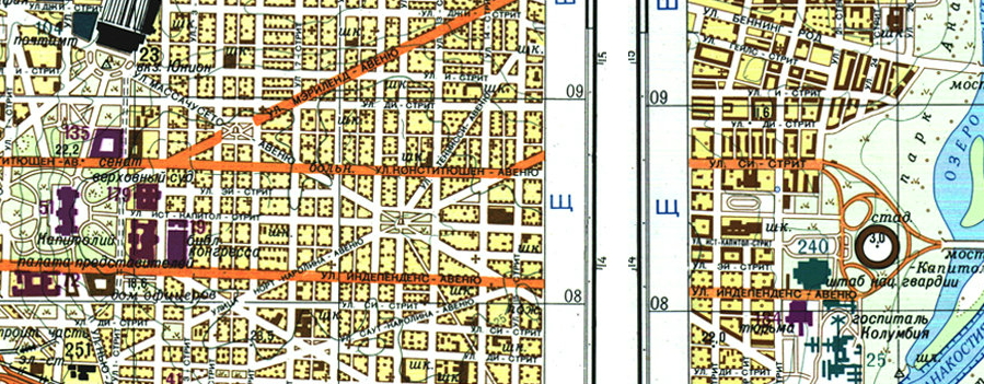
Detail of the Soviet D.C. map.( John Davies via Architect of the Capital.)
The other big question is about the source of the data for the map. Obviously, today any map can be created and/or checked by simply going to Google Maps. In the 1960s, that was not exactly an option, so maps had to be made with whatever was at hand. One main source was pictures taken by either planes or satellites (the Soviets launched their first surveillance satellite in 1962) The quality of the pictures could be compromised any number of ways, not the least in that the images were not necessarily taken from directly above. Thus, some of the buildings look distorted. In particular, as Architect of the Capital points out, the Rayburn House Office Building looks quite different on the map than it does in real life.
However, if you look at the 1960s-era USGS topographic map, the Rayburn does not look terribly symmetric, either. Given the fact that the US freely sold their maps (in contrast to the Soviet Union, where the maps were carefully kept secrets) it is certainly possible that they were used by their Cold War foes.
The Soviet maps even went as far as to indicate individual houses – though those tend to be more randomly placed than showing reality. And Gessford Court? Just like when I tried to find it on a map for WETA, it is nowhere to be found.
Have a look at the D.C. map here; if you want a more in-depth look at these maps (and the men who love them) Wired has you covered.